The new Apple TV App takes some getting used to. Above all, a decent landscape fashion is missing.
The Apple TV app needs some structure.
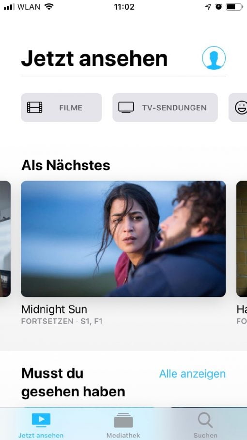
The new design of the Apple TV App introduced with iOS 12.3 takes some getting used to. It differs strongly from the conventional Apple design and relentlessly relies on horizontal scrolling through the content. The first reaction with this navigation view was to simply hold the iPhone horizontally to see more content in the row – but the app doesn’t support that. Quite apart from the fact that most streamingapps don’t support this absurdly (we also watch videos crosswise, so what’s the point?), it’s even more annoying with the Apple TV app because the displayed images for the content are so large that you automatically want to have a better overview and rotate the iPhone.
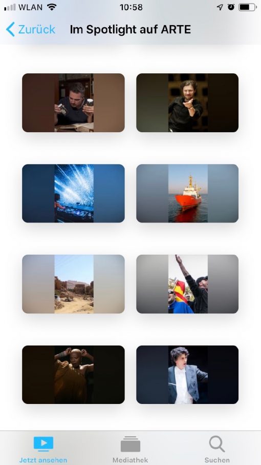
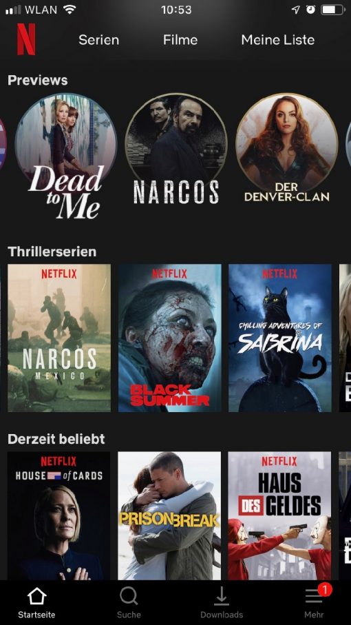
A direct comparison with the Netflix app makes this clear: if you open it, you’ll have about nine contents in the view, with the Apple TV app it’s much less, but you’ll get big headlines. Overall, however, Netflix has worked out the navigation much better. It’s also strange that Apple, like Netflix, only focuses on pictures when it comes to content overview, but in some cases the titles of the respective productions are difficult to read or simply not available at all.
For the fact that the Apple TV app should be the meta-level for all streaming services and also a sales platform, the implementation is surprisingly mediocre. Almost all other apps from streaming providers are much better structured. Apple could also have simply taken over the design of their own App Store and filled it with videos, which would have been better.
But maybe there will be some improvements on the way to iOS 13. Some product design takes its time. But as it is at the moment, it is simply not inviting.


