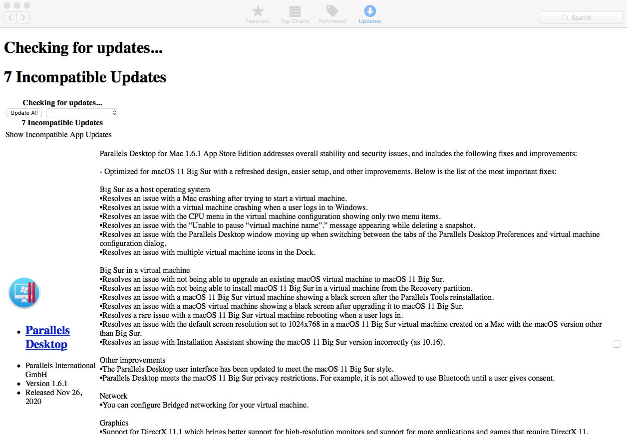
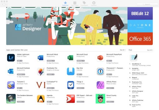
If you’re still using an older Mac, you may have noticed lately that the App Store app update page looks a little strange. It is no longer as nicely formatted as all the other App Store pages, but displays pretty much text only.
Apparently clean CSS is missing to bring some style to the page. But you don’t have to be afraid: the page only lacks formatting. Although this makes updates a bit confusing, there is still an update button for the installable updates and also the download progress is shown. So the actual function is not limited.
The bug is known and it seems to be Apple’s adult way to scare users of an older Mac and to push them to just buy something new. However, the fact that this sometimes also occurs on models from 2017 that are still running macOS 10.13 is still somewhat surprising. Not only High Sierra is affected by this formatting “trick”, but also all versions before that, i.e. Sierra, El Capitan, etc. Starting with Mojave, Apple also allows a nice update page again.
But as we said, don’t let it scare you. Sustainable behavior is sometimes a bit exhausting. In this case, however, you just have to limit your sense of aesthetics a bit.


