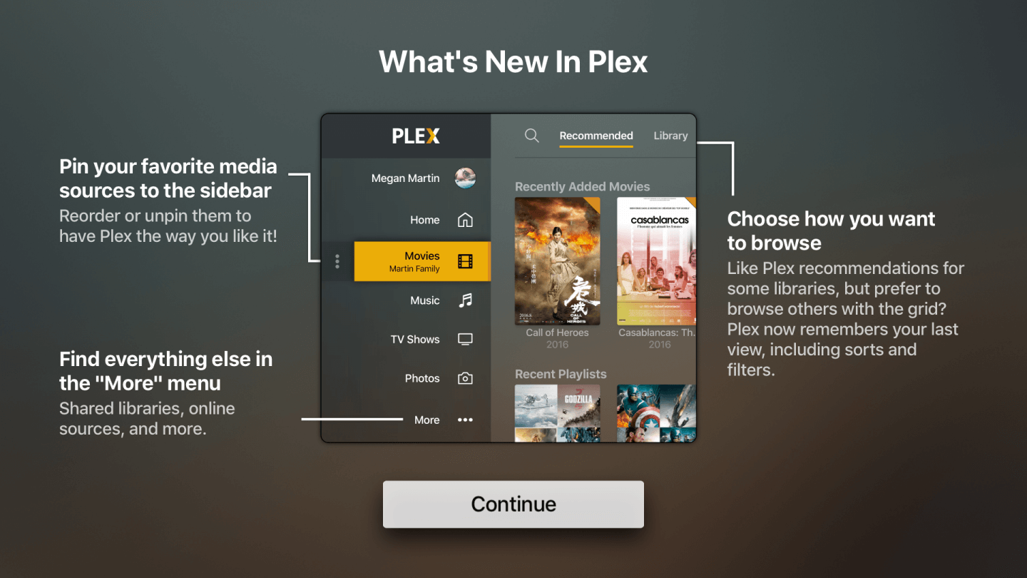
Plex has revised the user interface for the Apple TV.
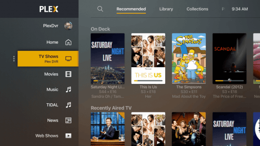
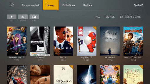
From now on the beta version is available and should allow a clearer control. Fewer clicks will be necessary to reach the desired destination and you will be given the opportunity to customize the navigation points according to your wishes.
The core of the new UI is a sidebar that lists your media sources. If you are a Plex user because you always rip your BluRays yourself, take a look at the new design. It differs from the usual Apple TV scheme, but that can be an advantage.
If you don’t have an Apple TV in use but a Roku you can also enjoy the new design.
